Popovers
The Accordance popovers float above the Workspace when the relevant item is clicked. The popovers provide access to additional information, or options. Popovers close automatically when the cursor is moved outside of them.
 |
Note You can also use the Window menu to open the Library, Instant Details, Highlights, and Character panels or popovers. |
| Popover | How Accessed | Used To... |
|---|---|---|
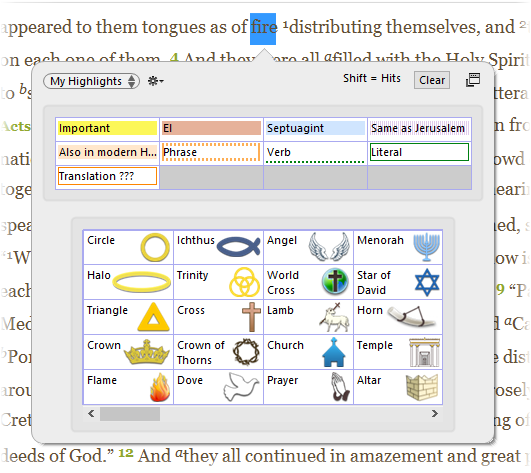
| Highlights |
Via the Toolbar, click:
|
Highlight text with defined highlight styles
|
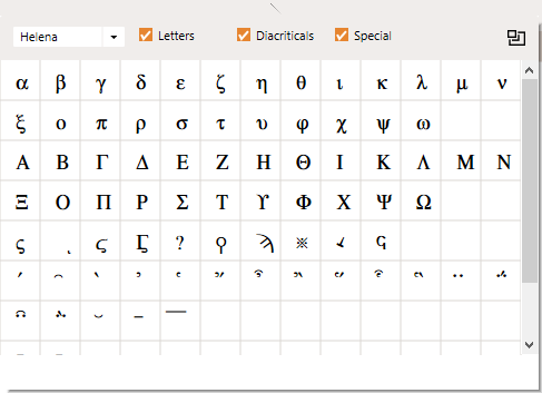
| Character |
From the Window menu, click Characters, or via the Toolbar, click:
|
Display and enter special characters from Accordance fonts
|
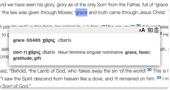
| Instant Details | Click and hold on a word in a Text or Tool module Any Bible text, or other single tool that can be read in Accordance, including reference texts and articles; may also be referred to as content or resource; appears only if the Instant Details panel is not open in the current Workspace and display as a Popover was enabled in the Preferences dialog box (Instant Details area) Any Bible text, or other single tool that can be read in Accordance, including reference texts and articles; may also be referred to as content or resource; appears only if the Instant Details panel is not open in the current Workspace and display as a Popover was enabled in the Preferences dialog box (Instant Details area) |
Displays more information about the word, link, or place currently under the cursor
|
| Library |
If the Workspace is too small, the Library opens as a popover. In addition, you can have the Library open each time as a popover via the Preferences (Appearance area). |
When accessed as a popover, the Library automatically closes after each use. 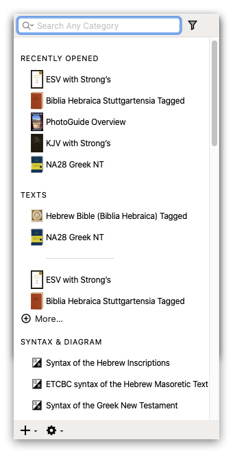
|
| Picture | Click a picture in a Tools module to view it as a popover. |
Once displayed as a popover, you can navigate between pictures, or open the picture in a new Pictures zones.
|